Data Visualization over 2024 Spotify data
Analysis
Powerpoint
Presentation
Design
Code
-
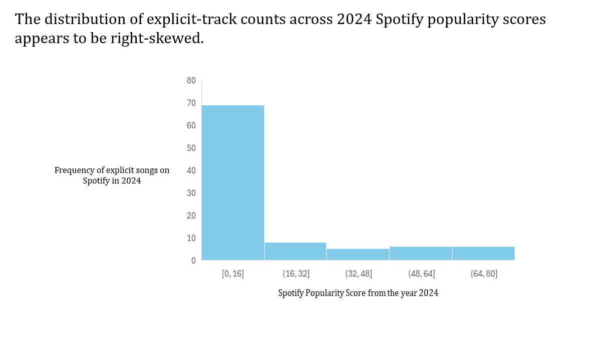
What is the statistical distribution of explicit songs in the dataset? The distribution was determined by analyzing the frequency of explicit songs across Spotify’s popularity scores. After cleaning the data to retain only the relevant columns, a pivot table was used to organize the information. The table counted the number of explicit songs and grouped them by Spotify popularity score, effectively creating bins based on the counts of explicit tracks.
-
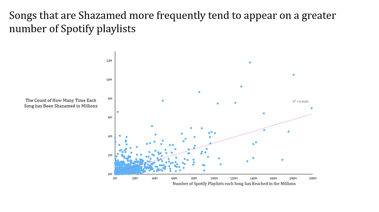
Does the number of Shazams a song receives correlate with the number of Spotify playlists that feature it? To construct the scatter plot, we plotted each song released in 2023 using its Shazam count and Spotify playlist reach to visualize the relationship between the two variables. We reformatted the x- and y-axes to improve readability by applying custom number formats that produced a more realistic and interpretable scale. A linear trendline was added and the R² value included to quantify the strength of the relationship. Axis titles and a short statement above the figure summarize our conclusion.
-
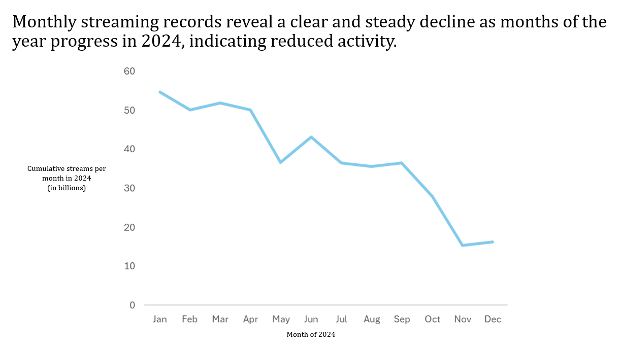
Is there a monthly pattern in average streaming counts throughout the year? In order to create this time-series graph, we used the release date of songs and the sum of streams throughout each year. We then created a pivot table that filtered through the release dates and only returned the year of 2024 and each month within that year. The values used were sum of streams per each of the months of the year 2024. Excel made a recommended time-series plot and then we removed the horizontal lines. We added titles that accurately represented the necessary axis’s. After doing this, there is a clear downward pattern shown in streams per month as the months of the year progress.
-
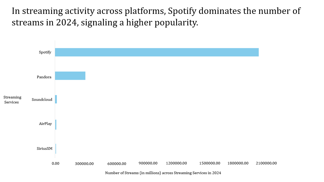
Is a certain streaming service more popular than others? To create this bar chart, we used Spotify Streams, AirPlay Spins, SiriusXM Spins, Pandora Streams, and Soundcloud Streams. We created a pivot table and moved all the services to the Values section to get the Sum of each streaming service. We divided the streams by a million to make the chart easier to visualize and used Excel’s recommended bar chart. We changed the color, axis scale, and added axis titles that reflect what is being compared. There is a clear skew between the streaming services, with Spotify having the most streamed songs, indicating a higher popularity/preference for that platform.